If you’ve ever looked at a gold price chart and felt completely lost, you’re not alone. Charts can look intimidating at first glance — full of lines, bars, and numbers that seem to tell a story you don’t quite understand yet. The good news is that reading a gold price chart is a skill anyone can learn, and once you grasp the basics, you’ll have a much clearer picture of what gold is doing and why it matters to your financial decisions. This guide breaks everything down in plain language so you can start reading charts with confidence.
What a Gold Price Chart Actually Shows You
At its most basic level, a gold price chart is a visual record of how the price of gold has changed over time. The horizontal axis (the bottom of the chart) represents time — this could be minutes, days, months, or even years depending on the timeframe you select. The vertical axis (the side of the chart) shows the price of gold, typically quoted in U.S. dollars per troy ounce.
When you look at a chart, you’re seeing the story of supply and demand playing out over time. Every spike upward tells you that buyers were pushing hard for gold during that period. Every dip tells you that selling pressure was stronger. The overall shape of the chart — trending up, trending down, or moving sideways — gives you a quick sense of gold’s broader momentum.
It’s important to understand that the price shown is the spot price — the current market rate for gold in its raw, unrefined form. When you buy physical gold coins or bars, the actual purchase price will be slightly higher than spot due to premiums that cover manufacturing, distribution, and dealer costs.
Understanding Different Chart Types
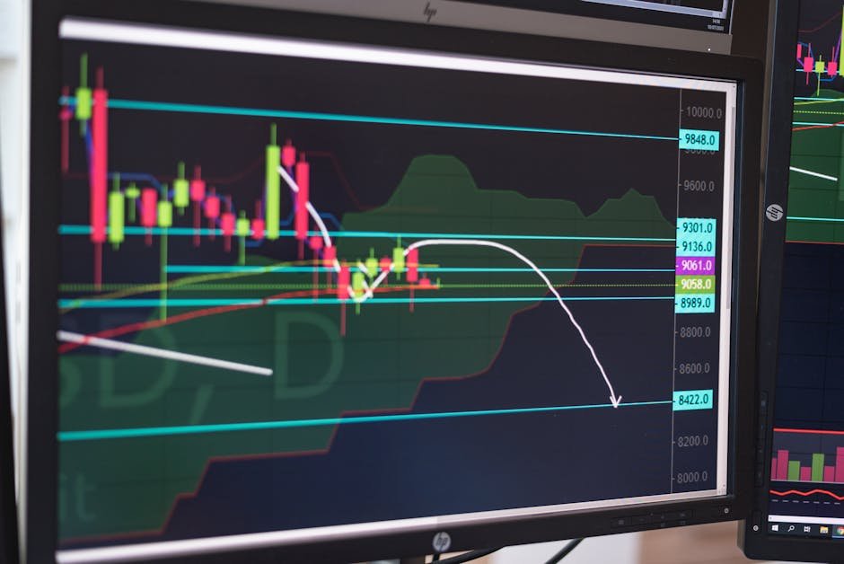
There are several ways gold price data can be displayed, and each one offers a slightly different level of detail. The three most common chart types are line charts, bar charts, and candlestick charts.
A line chart is the simplest version. It connects closing prices from one time period to the next with a single continuous line. This is great for getting a clean, uncluttered view of the overall price trend. If you just want to know whether gold has been going up or down over the past year, a line chart gives you that answer quickly.
A candlestick chart is more detailed and is widely used by experienced investors. Each “candle” represents a specific time period and shows four pieces of information: the opening price, the closing price, the highest price reached, and the lowest price reached during that period. A filled or red candle typically means the price closed lower than it opened; a hollow or green candle means the price closed higher. Once you get comfortable reading candlesticks, you can extract a lot of useful information from a single glance.
Key Terms You Need to Know
Before you can read a chart well, you need to understand the vocabulary that goes with it. Here are the most important terms:
- Spot Price: The live market price for one troy ounce of gold at any given moment.
- Support Level: A price level where gold has repeatedly stopped falling and bounced back up. Think of it as a floor.
- Resistance Level: A price level where gold has repeatedly struggled to break through on the way up. Think of it as a ceiling.
- Trend: The general direction the price is moving — upward (bullish), downward (bearish), or sideways (consolidating).
- Volume: How much gold is being traded during a given period. High volume during a price move suggests the move has real strength behind it.
- Moving Average: A line drawn on the chart that smooths out daily price fluctuations to show the average price over a set number of days, such as the 50-day or 200-day moving average.
You don’t need to master all of these concepts overnight. Start by identifying the basic trend and the support and resistance levels. Those two pieces of information alone will tell you a great deal about what gold is doing at any given time.
What Drives the Movements You See on the Chart
A chart doesn’t exist in a vacuum — every move has a cause. Understanding what drives gold prices helps you make sense of what you’re seeing rather than just memorizing patterns. Gold tends to rise when investors are nervous. Economic uncertainty, inflation concerns, geopolitical tensions, and weakness in the U.S. dollar are all factors that historically push gold prices higher.
Conversely, gold often faces downward pressure when the economy is strong, interest rates are rising, or investor confidence in riskier assets like stocks is high. When interest rates go up, the opportunity cost of holding gold — which pays no interest or dividends — increases, which can reduce demand.
Major chart movements are frequently triggered by economic data releases, Federal Reserve policy announcements, or global events. If you see a sharp spike or drop on a chart, it’s usually worth checking the news for that date to understand what caused it. Over time, you’ll start to recognize which types of events move gold and by how much.
How to Choose the Right Timeframe
One of the most common mistakes beginners make is focusing on only one timeframe. A chart that shows the last 24 hours of price action might look completely different from one showing the last five years. Both perspectives are useful — they just answer different questions.
Short-term charts (days or weeks) are useful if you’re trying to time a purchase and want to see if prices have been trending up or down recently. Long-term charts (years or decades) are better for understanding gold’s role as a store of value and seeing how it has performed through major economic cycles. Most experienced buyers look at multiple timeframes together to get a complete picture.
For a physical gold buyer, the long-term chart is often the most meaningful. It shows you the broader context — whether current prices are elevated relative to historical norms or represent a period of relative value.
Putting It All Together as a Physical Gold Buyer
Reading charts is a tool, not a crystal ball. No chart will tell you with certainty where prices are going next, and anyone who claims otherwise is overpromising. What charts can do is help you make more informed decisions about when to buy, how to think about current prices relative to history, and how to track your holdings over time.
When you’re ready to check live gold pricing and browse physical gold products, Absolute Bullion offers transparent, up-to-date spot pricing alongside a wide selection of coins and bars for all budget levels. Understanding how to read the price chart behind those numbers makes you a more confident buyer at every step of the process.
Start Reading Charts with Confidence
Learning to read a gold price chart is one of the most practical skills you can develop as a precious metals buyer. Start simple — identify the trend, find the support and resistance levels, and choose a timeframe that matches your goals. As you spend more time with charts, the patterns and vocabulary will become second nature.
Whether you’re buying your first gold coin or adding to an existing collection, chart literacy puts you in a stronger position to understand the market you’re participating in. Visit absolutebullion.com to see current spot prices, explore available products, and take the next step in your gold buying journey.